The All-White Coastal Room Is Not a Rule
An all-white coastal room is only one option. Use restrained contrast, tactile materials and a small colour palette to make a calm room feel personal.
You set a whitewashed bowl on a pale console, step back, and notice that the whole room seems to blur into one bright surface. An all-white coastal room can feel restful, but it is not the only route to calm. A little contrast, chosen with care, gives the eye somewhere to pause and lets the materials of a shoreline home speak.
Does coastal style have to be white?
No. Coastal style can draw on weathered timber, deep water, sea grass, shell, stone and changing skies; none demands a room of white walls and matching furniture. White is useful because it reflects light and gives furnishings a quiet background, but it is a choice, not a rule.
Start with what you want the room to feel like. A north-facing sitting room may suit warm, muted colours that soften cool daylight. A sunlit room with a strong sea view might benefit from a darker note that gives the bright exterior a visual counterweight. These are starting points, not formulas: the same blue can look grey in one room and vivid in another.
Think of a room as a bowl of stones from the shore. If every stone is the same pale shade, their shapes disappear; a darker one makes the edges around it easier to see. In a room, that difference might come from a timber chair, a shaded lamp, a patterned cushion or a painted cupboard rather than a whole dark wall.
How do I choose coastal colours?
Choose a small palette from a real feature in the room, then let one colour lead. Look at a piece of driftwood, a woven basket, a harbour view or a favourite ceramic. Pull out a main tone, a supporting neutral and a quieter accent. The colours need not match exactly; a shared undertone can make them sit comfortably together.
For example, grey-brown timber could suggest a warm stone wall colour, a soft blue-green on a cushion and a small touch of rust in a glazed pot. If the room already has a strong floor or a vivid view, treat that as part of the palette rather than introducing several new colours.
Before painting, bring home sample cards or small sample pots and look at them beside the floor, upholstery and window trim at different times of day. A colour that looks gentle in a shop can appear much stronger in direct sun. Check the finish and preparation advice on the product label; for a surface that needs specialist treatment, ask a decorator.
Which contrast feels calm?
Calm comes from controlling how many things compete, not from removing every difference. Use one or two clear contrasts, then repeat a related tone elsewhere so the room feels connected. A dark table can echo the line of a picture frame; a blue-green cushion can pick up a small detail in a rug.
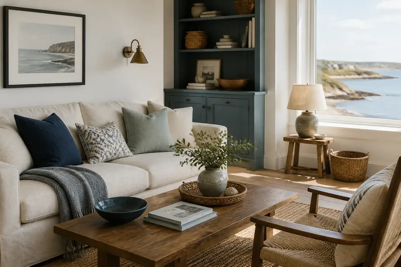
Contrast can be gentle. Pair chalky walls with honey-toned wood, or a pale linen sofa with a charcoal throw. If you prefer stronger colour, keep it to a defined area, such as a painted bookcase or a pair of cushions, and leave breathing space around it. A room usually feels more settled when a bold note has a few quiet neighbours.
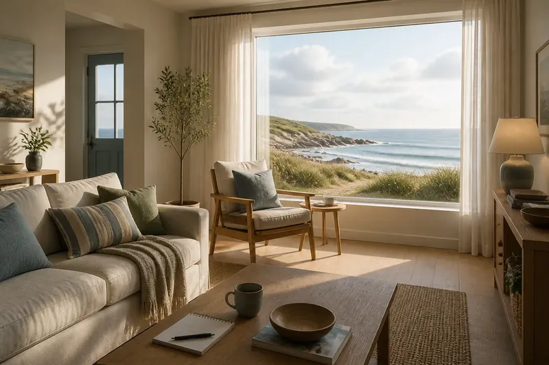
Say you have a pale room with a light sofa and a bleached-wood coffee table, but it feels flat. Add a navy cushion, a dark-framed print and a small bowl with a blue glaze, while leaving the larger surfaces alone. The expected visible change is a clearer visual rhythm, not a dramatic transformation; if the accents draw too much attention, remove one and look again.
How can texture add depth?
Texture creates variation even when colours stay close. Combine a smooth painted wall with linen, a nubby wool throw, woven rush, glazed pottery or the grain of an old timber piece. Each material catches and softens light differently, so a restrained palette need not look blank.
Choose textures for how they feel and how they suit daily use. Linen curtains move lightly, while a tightly woven rug may be easier to keep tidy in a busy room. A rough basket can balance polished glass, but too many coarse or rustic finishes can make the room feel crowded. Let one or two tactile materials take the lead.
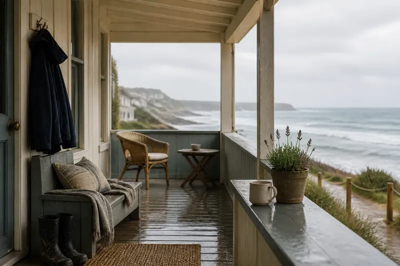
Coastal materials often carry signs of their surroundings: salt marks, sun fading and worn edges. These details can add character, but they need not be imitated everywhere. A single weathered stool or hand-thrown vessel can offer enough irregularity beside cleaner, simpler furnishings.
What should I keep neutral?
Keep the parts that are expensive or awkward to change quieter, if that suits your home. A neutral sofa, timber floor or simple curtain can make it easier to alter cushions, artwork and accessories as your preferences shift. Neutral does not have to mean white: sand, putty, soft grey and muted green can all provide a restrained base.
There is no need to replace furnishings simply because they do not match. Group pieces by one shared feature, such as a similar wood tone, rounded shape or woven surface. When items have different colours, a repeated material or silhouette can make the mix feel deliberate.
Before buying anything, remove a few accessories and look at the room’s larger shapes: walls, floor, sofa and windows. Decide which of those should remain quiet and where you want the eye to land. This makes it easier to avoid buying several small objects that add colour but do not solve the room’s underlying lack of contrast.
What if my room gets strong light?
Strong light can wash pale colours out at one time of day and make them look sharper at another. Try samples on more than one wall, particularly if the room receives direct sun or has a large view. Check the room in ordinary use rather than judging it from a single bright moment.
To retain a sense of calm, balance bright surfaces with matte finishes and a few deeper tones. A linen shade, a timber side table or a muted-colour rug can absorb some visual brightness without making the room feel heavy. If the view is already lively, keep patterns simple indoors so the scenery and furnishings do not compete.
How do I mix old and new?
Give older and newer pieces a shared thread. A contemporary sofa can sit beside a worn wooden chest if both have simple lines; a modern lamp can feel at home near a handmade bowl when their colours relate. The aim is not to make everything look like a matched set, but to make each difference feel considered.
Try moving existing objects before adding new ones. A coastal room often gains character from useful things already at hand: a sturdy bench, a framed map, a woven tray or a ceramic jug. Keep surfaces usable, and leave some empty space so the distinctive pieces remain visible.
The all-white coastal room remains a sound choice if it suits your light, materials and habits. But a personal room can be just as restful with a limited palette, a few deliberate contrasts and textures that reward a closer look. Begin with one change you can reverse, such as a cushion or a piece of art, and let the room’s actual colours—not an imagined seaside formula—guide what comes next.